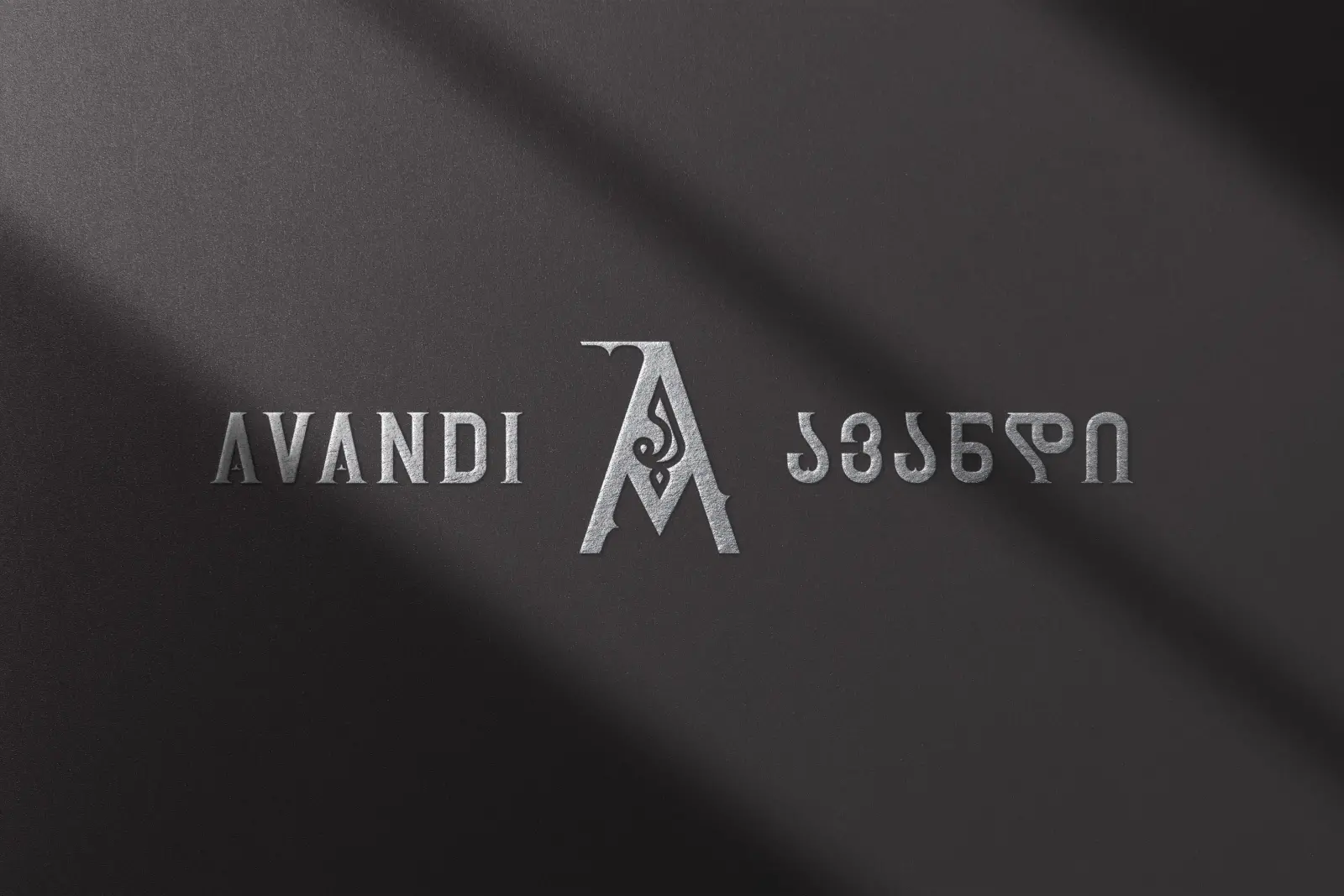
Logo Description: The Architecture of a Name
In 2023–2024, AVANDI, a Georgian winery with deep roots and bold vision underwent a quiet yet profound transformation. Formerly known as ALAZANI, the rebrand to AVANDI marked more than a change in name. It signaled a shift in identity: from tradition alone to a philosophy of building tradition for the future.
At the heart of this transformation stands a single letter the Latin “A”, shaped with the soul of the Georgian “ა”. This fusion is not ornamental. It is architectural.
The letter “A” in both alphabets symbolizes origin, structure, and ascent the first step in both language and legacy. By weaving the Georgian “ა” into the Latin form, the logo becomes a visual bridge between two scripts, two cultures, and two philosophies: preservation and innovation.
The word “Avandi,” as ancient Georgian sources suggest, can be traced to meanings of “rule” or “foundation.” This aligns with the brand’s promise: to build wines that deserve to be remembered, crafted with the precision of an architect and the soul of a storyteller.
The design draws upon historical, linguistic, and cultural depth, echoing the winery’s architectural inspiration where Gothic arches meet Georgian stone, and old methods meet new classics.
Ultimately, the AVANDI logo is not a mark. It is a message.
A declaration that wine is not only memory - it is structure, language, and legacy.